Journal · Essay · 5 min
The notch is a UI surface. Treat it like one.
By Ziyarex ·
There is a black rectangle at the top-center of every modern MacBook display. It sits in the most valuable row of pixels on the machine, eye-level, always visible, never covered by windows. And by default it does exactly nothing.
The iPhone already solved this
When the iPhone got its cutout, Apple's answer was the Dynamic Island: turn the dead zone into a live zone. Now playing, timers, directions, background activity. Glanceable state, anchored to the one place your eye already knows to check. It worked so well that the cutout became a feature.
The Mac's notch got none of this. It's a bezel that migrated inward.
What glanceable state means on a Mac
Think about what you check many times an hour:
- What's playing, and skipping it without hunting a tab
- A timer you set twenty minutes ago
- Whether that export, upload or notarisation finished
- The file you're about to drag somewhere
None of these deserve a full window. All of them deserve a glance. The menu bar technically holds them, as a strip of 14-pixel monochrome icons competing for space. The notch could hold them the way the Island does: as live activities with real type and colour.
So we built it
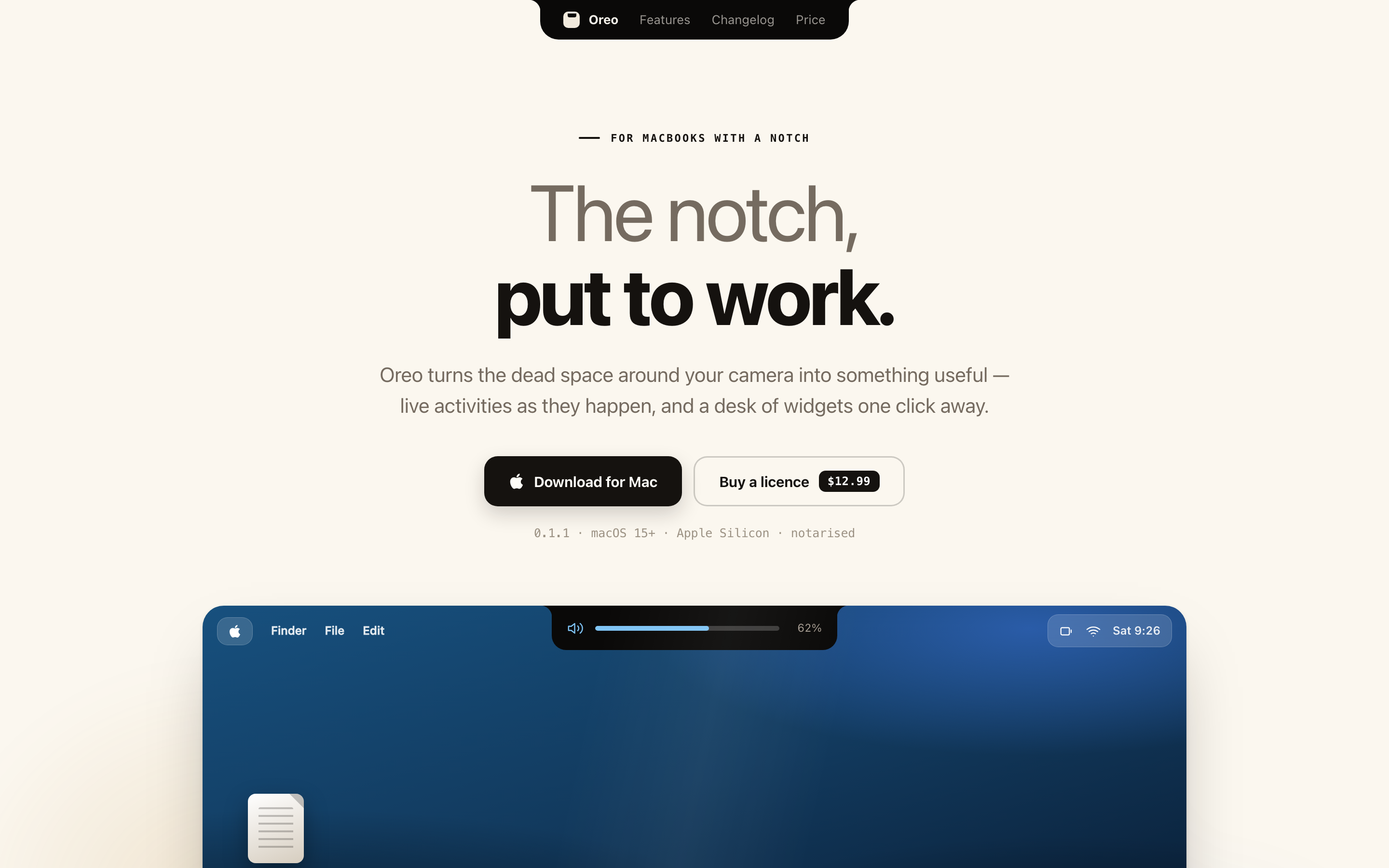
Oreo turns the MacBook notch into exactly this: live activities that expand on hover, a drawer of widgets, and a file tray where you can park drags. It's $12, once.
We're not alone in thinking this: the category exists, and the honest comparison covers where the other notch apps beat ours. The point of this essay is smaller than any one app: the notch is a UI surface. Someone should be using yours.
 Oreo
Oreo