Journal · Guide · 6 min
Your menu bar is out of room. Here's the triage.
By Ziyarex ·
Open a fresh Mac and the menu bar has maybe six things in it. Eighteen months later it has twenty-four, the ones on the left have vanished behind Safari's menus, and you have no idea what four of the icons do.
This isn't a discipline failure. It's a design incentive. Every utility that ships wants ambient presence, the menu bar is the only always-visible surface an app can claim without stealing a Dock slot or a window. So every utility claims it, whether or not it has anything to say.
The constraint nobody warns you about
Menu bar items don't scroll. They get overlapped. macOS gives the frontmost app's menus priority from the left, and status items fill from the right; when the two meet, yours silently disappear. On a 13-inch screen with an app that has a lot of menus, you lose items you're still paying for.
The notch makes it worse by carving a hole in the middle of the run. Items don't wrap around it, the usable width just shrinks. A 14-inch MacBook Pro running an app with wide menus can hide half your status items with no warning and no indicator.
So the question isn't "how do I fit more." It's "what deserves to be there at all."
The triage: three buckets, one rule each
Go through the bar left to right and put every icon in exactly one bucket. The rule for each is deliberately narrow.
Keep, it changes state you act on
An icon earns a permanent seat only if looking at it tells you something that changes what you do next. Not "I might click it someday." It has to be readable at a glance, in a 16-pixel monochrome glyph, without clicking.
Realistically that's three to five things. Battery when you're on the road. VPN when you're on someone else's network. The recording indicator when you're recording. A timer that's running.
Hide: useful, but only on demand
This is the biggest bucket and the one people get wrong. Clipboard history, screenshot tools, window managers, audio switchers. You use these constantly, but you use them by keyboard shortcut, not by looking at them. The icon is a launcher for something you never launch by clicking.
These don't need to be visible. They need to be running. Those are different requirements, and macOS has never distinguished between them, which is why a whole category of menu bar managers exists.
Quit, it's furniture
Anything you can't explain in one sentence. Anything whose app you've stopped using but whose helper still launches at login. Anything that's an advertisement for an app you already own.
Be honest here. The test is: if you can't remember the last time this icon helped you, it isn't helping you.
Doing it, without third-party software first
Before you install anything, macOS already gives you three levers.
Rearrange with ⌘-drag. Hold Command and drag any status item. Put your Keep bucket on the right, where the frontmost app's menus can never overlap them. This one takes two minutes and solves the "my important icons vanished" problem outright.
Prune Control Centre. A good chunk of what's up there is system modules, not apps. System Settings → Control Centre lets you set each one to "Show in Menu Bar", "Don't Show", or show only when active. Wi-Fi, Bluetooth, Sound, Focus, Now Playing, most people can move at least four of those into Control Centre itself and reclaim the width.
Kill the login items. System Settings → General → Login Items & Extensions. The "Allow in the Background" list is where the Quit bucket actually lives. Turning an icon off in an app's preferences usually leaves the helper running; turning it off here stops it.
Then, a manager for the Hide bucket
Once Keep is small and Quit is gone, whatever's left goes behind a divider you expand when you want it.
- [Ice](/discover/ice), free, open source, and now the default recommendation for most people. It hides items behind a divider, and it handles the notch sensibly.
- Bartender, the oldest and deepest option, with the best rules engine (show this icon only when it changes, hide it again after five seconds). Paid, and worth knowing that it changed hands in 2024 and the transition was handled badly enough that some long-time users left over it.
- Hidden Bar, free, minimal, does one thing.
None of these reduce the number of apps running. They reduce the number you see. That's the honest framing: a manager is a filing cabinet, not a diet.
The part where we admit our own bias
Three of the things in our own bar are ours, and they exist because of exactly this problem:
Oreo is the argument that some of this shouldn't be in the menu bar at all. Now playing, timers, progress on a long export, that's live state that deserves more than a 16-pixel glyph, and the notch is sitting right there doing nothing. That's a $12 opinion, and the honest comparison against the other notch apps is on this site too.
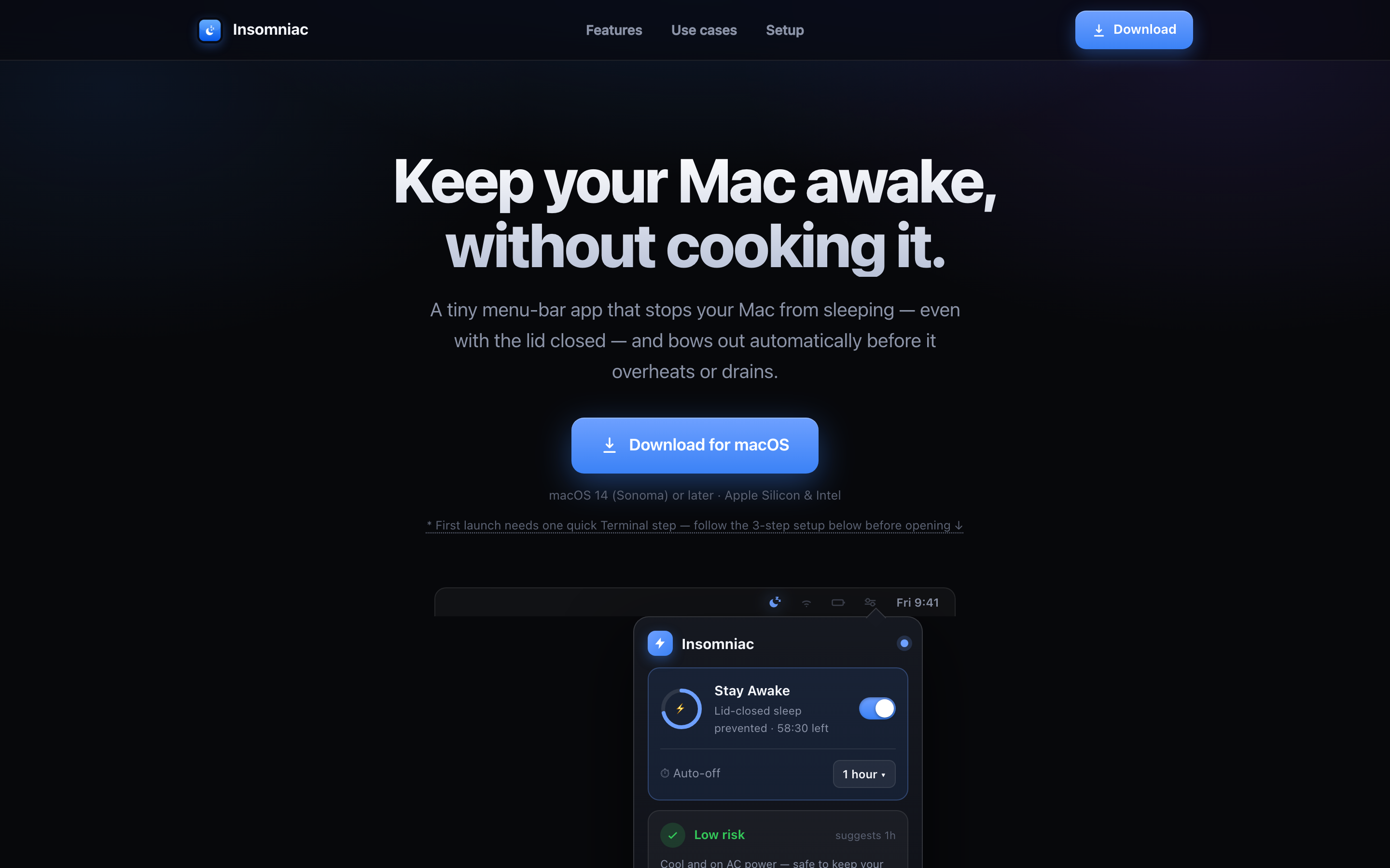
Insomniac is a Keep-bucket icon by our own rule: when it's on, your Mac isn't sleeping, and that's state you want to see without clicking. When it's off it's a static glyph, which is precisely why it's free.
Clickk fails our own test and we ship it anyway. It makes your keyboard sound mechanical. It tells you nothing. Put it in Hide, keep it running, enjoy it.
Re-run it quarterly
The bar refills. New app, new icon, and six months later you're back to twenty-four. Put a recurring reminder somewhere you'll actually see it (if you use Slate, that's your wallpaper) and run the three buckets again. It takes ten minutes and you get the top of your screen back.
 Oreo
Oreo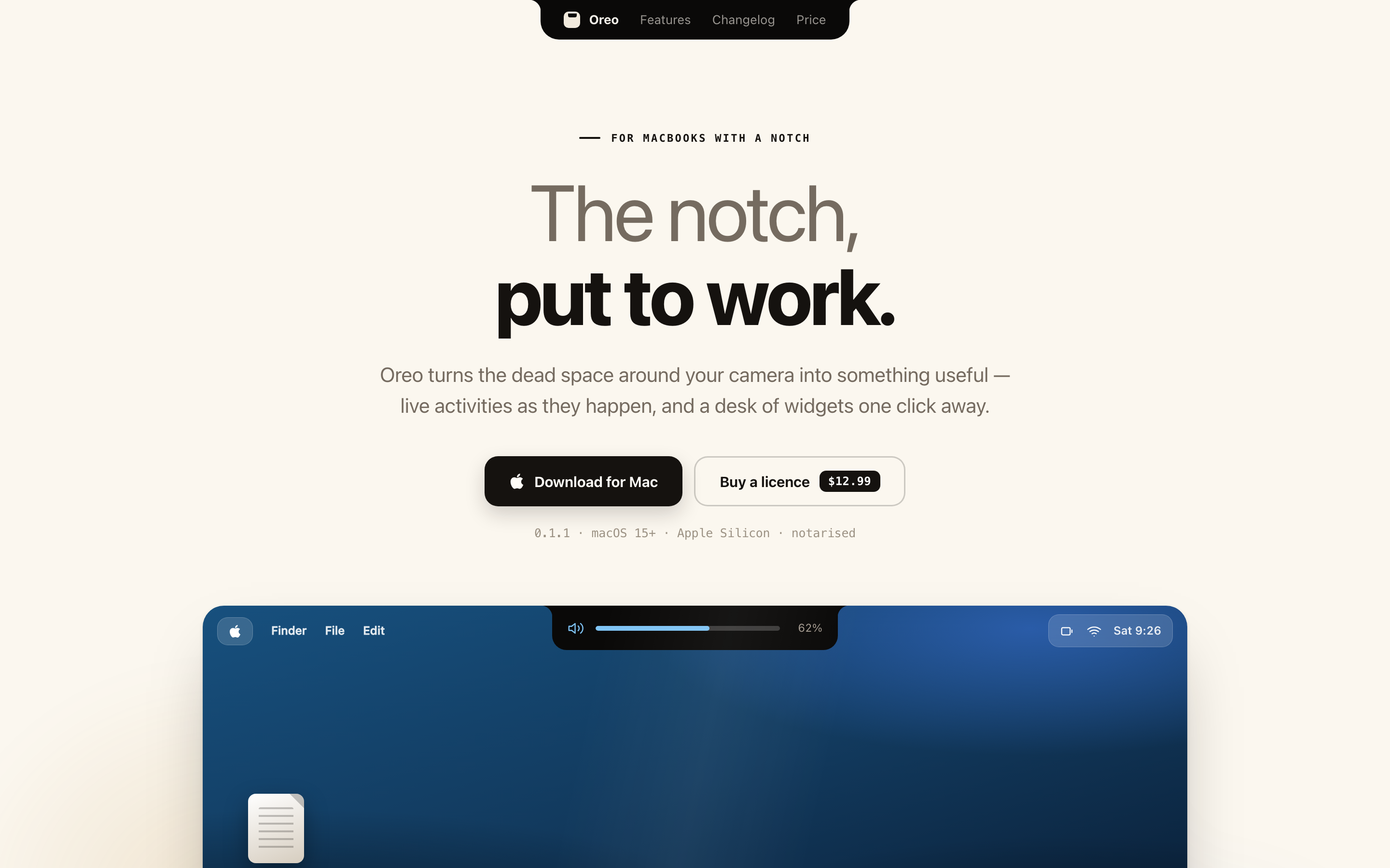
 Clickk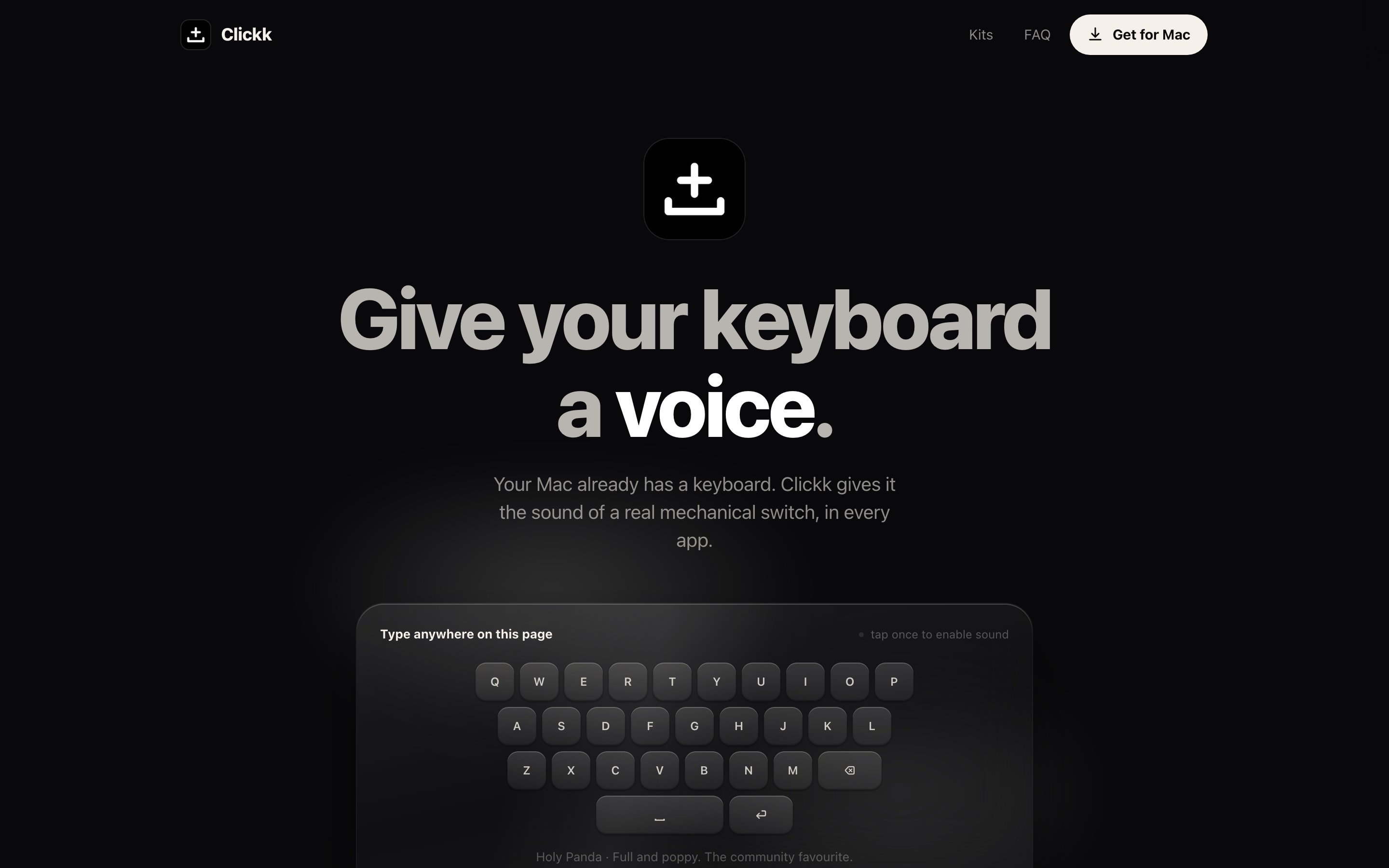
 Insomniac